29 Jan The Psychology of Color in Print Marketing: How It Impacts Your Brand
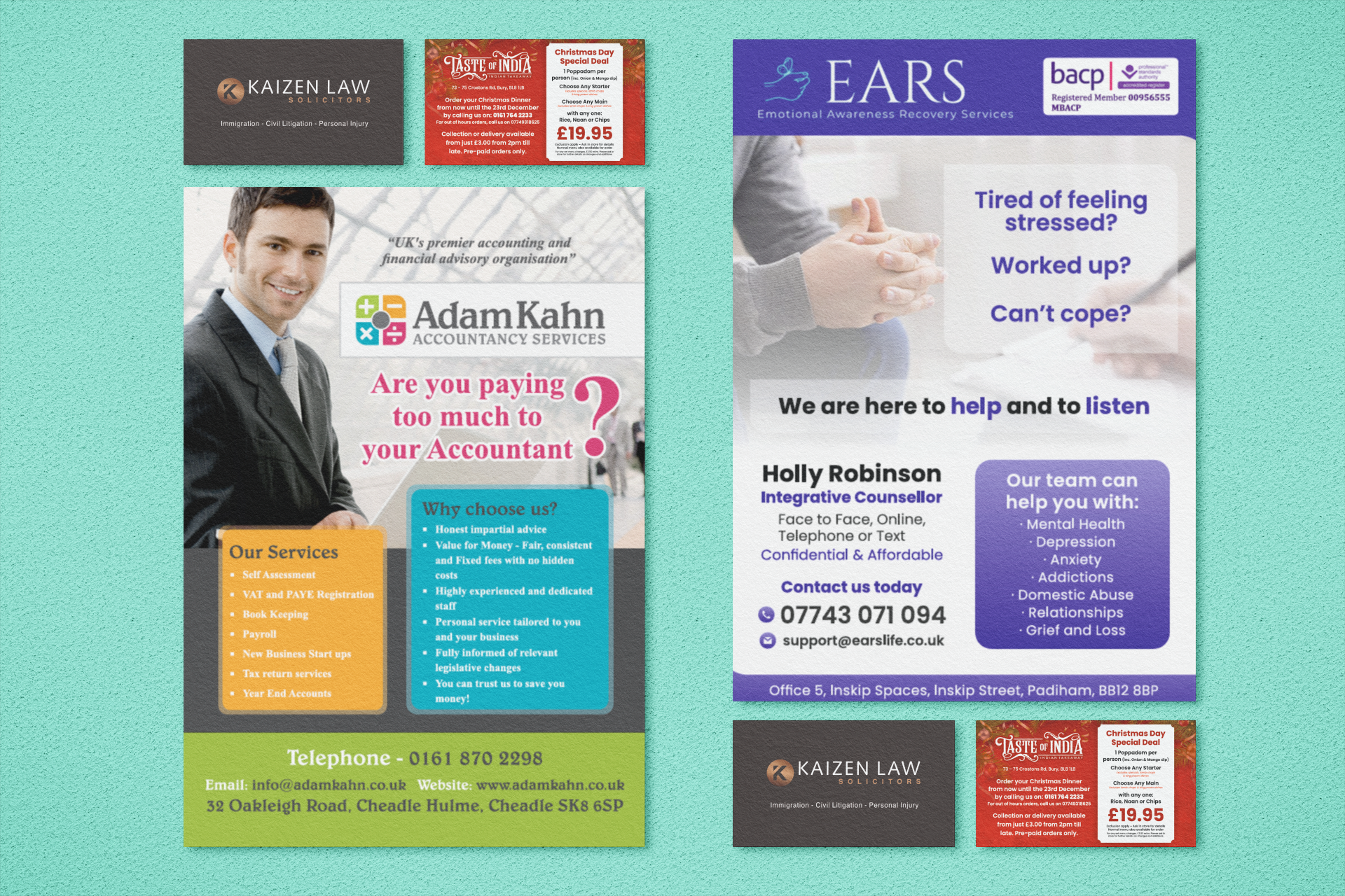
Colour plays a powerful role in marketing—studies show people form opinions on a brand within 90 seconds, with colour being a major factor. Choosing the right colours for your print materials can influence emotions, create trust, and drive action.
What Different Colors Mean in Marketing
🔴 Red – Bold, energetic, great for sales and fast food branding.
🔵 Blue – Trustworthy, professional, ideal for corporate and financial brands.
🟡 Yellow – Cheerful, inviting, best for retail and food packaging.
🟢 Green – Natural, calming, perfect for eco-friendly and health brands.
⚫ Black – Sophisticated, luxurious, used in high-end branding.
🟠 Orange – Playful, creative, and great for entertainment and youth brands.
🟣 Purple – Elegant, imaginative, used in beauty and premium brands.
How to Choose the Right Color for Your Prints
- Know Your Audience – Colors affect different demographics in different ways.
- Match Your Brand Identity – A law firm benefits from blue (trust), while a toy brand may use orange (fun).
- Ensure Contrast & Readability – High contrast improves legibility and impact.
- Stay Consistent – Keep your branding unified across all materials.
- Check Before Printing – Colors appear differently on screens vs. print.
Let Star Print Help You Get It Right!
At Star Print, we ensure colour accuracy and high-quality printing to make your marketing materials pop. Need design help? We offer custom designs and free design checks! Contact us today to bring your brand to life!

